Exploring MTA Tweets
I recently got my hands on a dataset of all the tweets from MTA’s official Twitter account for all of 2017 and up to July of 2018 from a colleague. He gathered it by scraping from Twitter’s API. There wasn’t really a target to predict, so this was mostly a practice in exploring data. No massive revelations were discovered, but there were some interesting bits to pull from the process. The repo for this project can be found on Github here.
After cleaning the tweets up, I decided to incorporate some unsupervised learning techniques and use Latent Dirichlet allocation to identify topics in the tweets. After looking at the results with two, three, and four identified topics, clustering them into two made most sense. Essentially the tweets can be categorized into a service update category, using words like delay, service, indicent, resumed, problem, running, allow, additional, signal, mechanical, and an apology category, using words/n_grams like regret, supervision, thank, inconvenience, matter, report, change, thanks.
# gensim prepares interavtive LDA model
# two general categories: service updates and apologies/explanations for those updates
pyLDAvis.gensim.prepare(ldamodel, corpus, dictionary)
Next we decided to create a target to predict. Using Regex, we identified the MTA employee who was the author of each tweet, which was signified by a circumflex and the author’s initials. We then used some NLP tools to use the tweet (with the author’s signature removed) to predict who the author was. The high accuracy rate of 84% on test data with a simple multiclass Logistic Regression model was surprising, and very interesting that it was able to pick up on the subtle differences in language between authors. There’s not a whole lot of value in these findings, but it’s a good practice and interesting to see how these models work.
tweeters[:10]
# Top ten authors we were predicting
['^JG', '^JP', '^BD', '^KF', '^GES', '^DG', '^JZ', '^HKD', '^RT', '^EE']
y.value_counts()
# Baseline accuracy is 20.28%
^JG     15382
^JP     13759
^BD     11511
^KF      6821
^GES     5762
^DG      5206
^JZ      4714
^HKD     4527
^RT      4442
^EE      3693
Name: sig, dtype: int64
These were features with the highest feature importances from a Random Forest Classifier model. This model worked with 80% accuracy on test data.
top_feat_importances = pd.DataFrame(list(zip(rf.feature_importances_, cv.get_feature_names())),
             columns=['f_importance','feature']).sort_values('f_importance', ascending=False).head(20)
top_feat_importances
| f_importance | feature | |
|---|---|---|
| 25933 | 0.006591 | good evening |
| 64959 | 0.006346 | time |
| 61677 | 0.005757 | supervision |
| 63703 | 0.005720 | thank |
| 28848 | 0.005119 | hi |
| 37829 | 0.005099 | location |
| 63199 | 0.004789 | tell |
| 50852 | 0.004534 | regrets |
| 40539 | 0.004356 | morning |
| 50183 | 0.004141 | reference |
| 25472 | 0.004011 | good |
| 59799 | 0.003989 | station |
| 21404 | 0.003985 | en |
| 48461 | 0.003833 | proceeding |
| 50472 | 0.003588 | referring |
| 26551 | 0.003408 | good morning |
| 64733 | 0.003396 | thanks |
| 10138 | 0.003297 | bound |
| 42163 | 0.003222 | mta nyc custhelp com |
| 49950 | 0.003149 | ref |
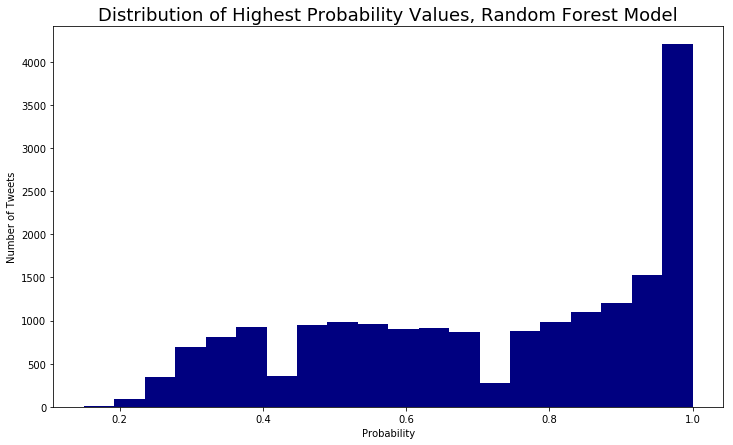
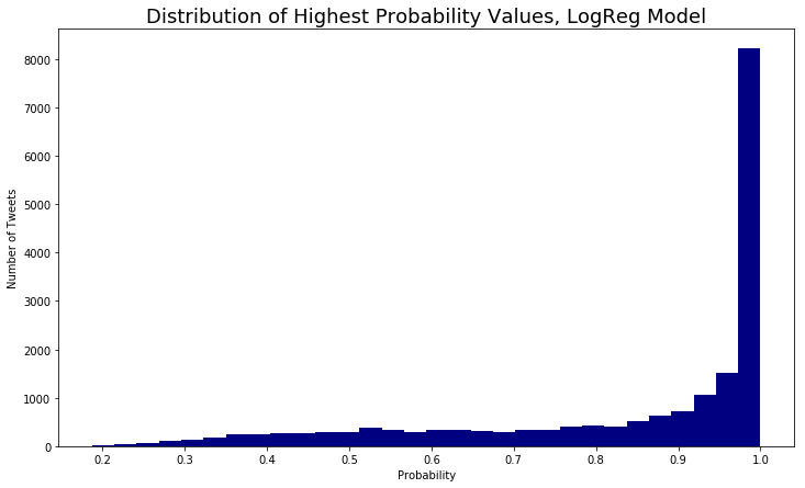
Looking at the highest value in the list of probabilities for each target, we can get a sense of how sure the model is of its predictions. You can see that the Logistic Regression model, which was also more accurate, has a distribution of probabilities that indicates it is more confident in its predictions than the Random Forest model.
# How sure is the model about its predictions?
plt.figure(figsize=(12,7))
plt.title("Distribution of Highest Probability Values, Random Forest Model", fontsize=18)
plt.xlabel("Probability")
plt.ylabel("Number of Tweets")
plt.hist(max_probs, color='navy', bins=20);
# Most probabilities are much higher, model is more sure of its predictions
plt.figure(figsize=(12,7))
plt.title("Distribution of Highest Probability Values, LogReg Model", fontsize=18)
plt.xlabel("Probability")
plt.ylabel("Number of Tweets")
plt.hist(max_lr_probs, color='navy', bins=30);
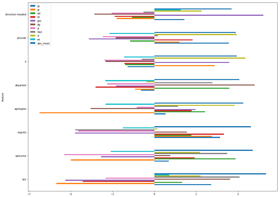
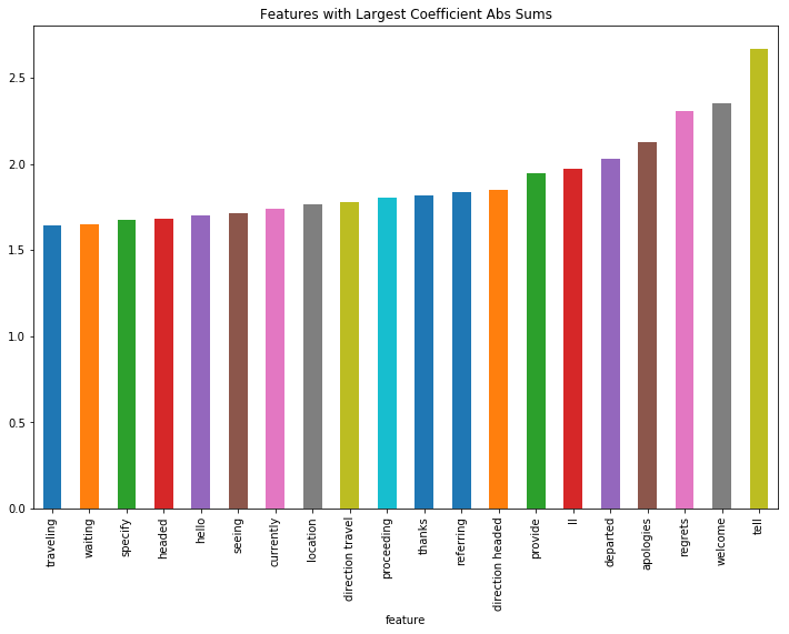
To find which features were most important overall, I created a dataframe of each coefficient by author (from the Logistic Regression model), with the sum and mean of the absolute values of the coefficients. The following plots show which features were most important overall and by author.
abs_coef_df = abs(coef_df)
abs_coef_df.head()
| jg | jp | bd | kf | ges | dg | jz | hkd | rt | ee | abs_sum | abs_mean | |
|---|---|---|---|---|---|---|---|---|---|---|---|---|
| feature | ||||||||||||
| 00 | 0.172850 | 0.287960 | 0.084425 | 0.170298 | 0.156555 | 0.305762 | 0.049209 | 0.008900 | 0.729685 | 0.101591 | 2.067236 | 0.375861 |
| 00 info | 0.119540 | 0.000602 | 0.005627 | 0.000786 | 0.035574 | 0.005080 | 0.003147 | 0.000155 | 0.172403 | 0.001891 | 0.344806 | 0.062692 |
| 00 info web | 0.119540 | 0.000602 | 0.005627 | 0.000786 | 0.035574 | 0.005080 | 0.003147 | 0.000155 | 0.172403 | 0.001891 | 0.344806 | 0.062692 |
| 00 info web mta | 0.119540 | 0.000602 | 0.005627 | 0.000786 | 0.035574 | 0.005080 | 0.003147 | 0.000155 | 0.172403 | 0.001891 | 0.344806 | 0.062692 |
| 00 pm | 0.035549 | 0.198963 | 0.054368 | 0.495864 | 0.029549 | 0.461121 | 0.302342 | 0.006940 | 0.004700 | 0.030295 | 1.619691 | 0.294489 |
# Exploring which features were most important across all authors

plt.figure(figsize=(12,8))
plt.title("Features with Largest Coefficient Abs Sums")
abs_coef_df['abs_mean'].sort_values().tail(20).plot(kind='bar')
<matplotlib.axes._subplots.AxesSubplot at 0x1a5861f898>
# what the correlations are between top features and each author with the abs_mean shown for indication of overall importance
# for example, JP doesn't use the word 'apologies' very often...
coef_df[[col for col in coef_df.columns if col !='abs_sum']].sort_values('abs_mean', ascending=False).head(8).plot\
(kind='barh',figsize=(18,14))
<matplotlib.axes._subplots.AxesSubplot at 0x1a5a4fd978>